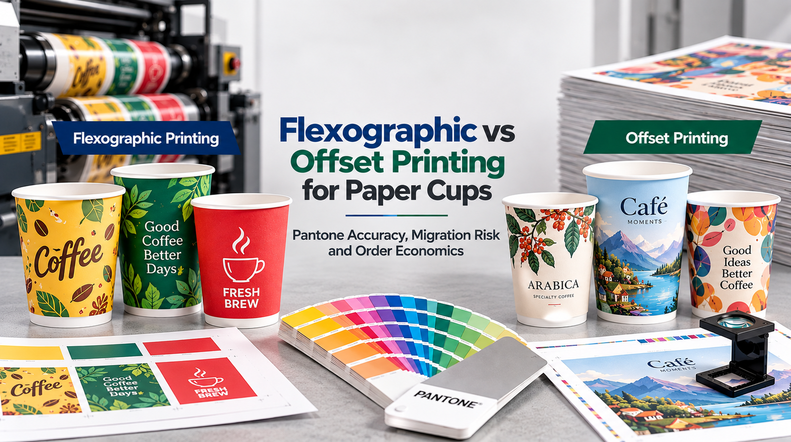
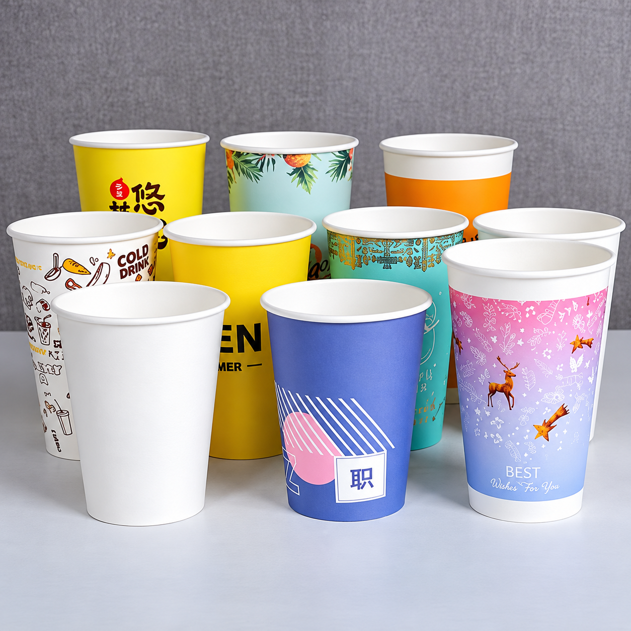
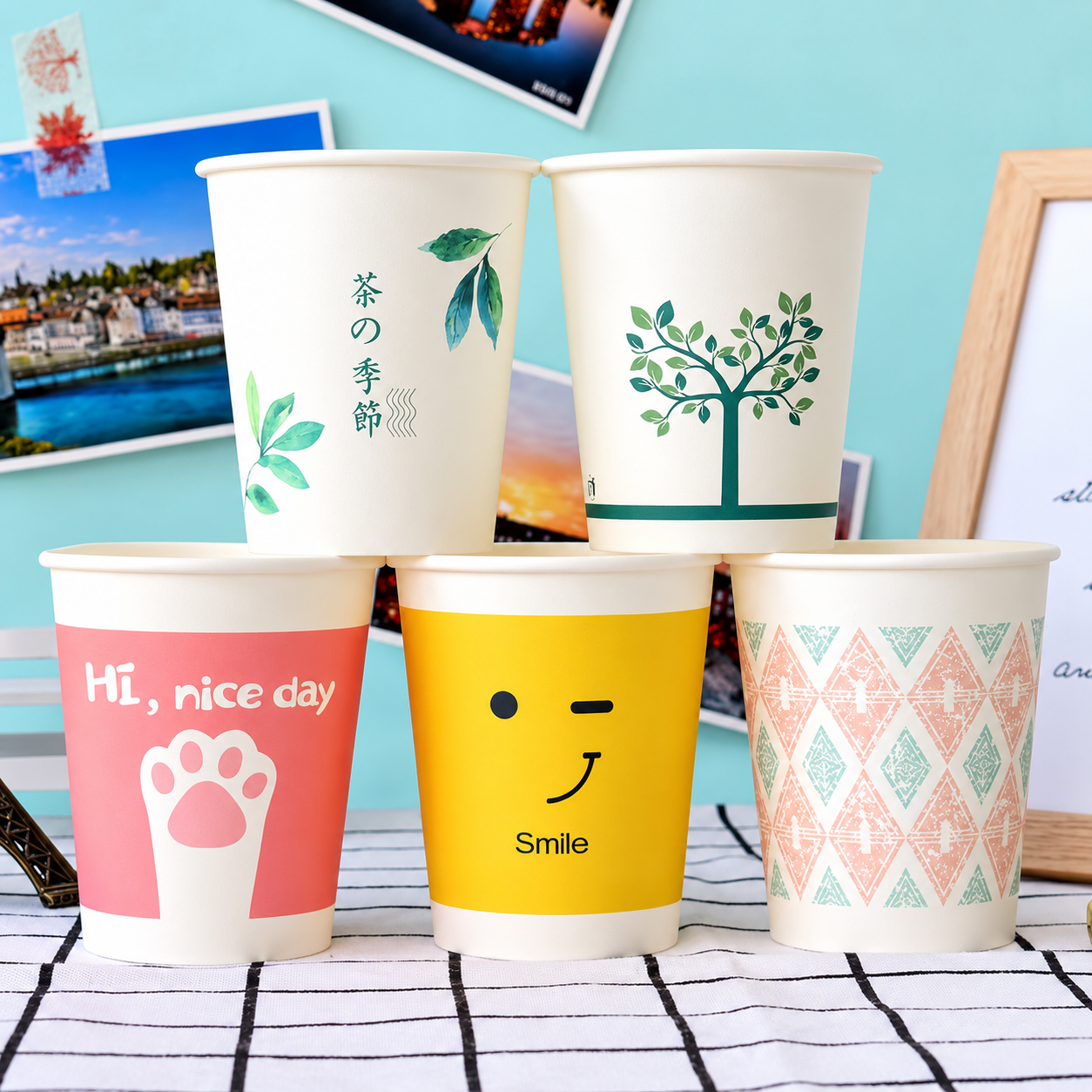
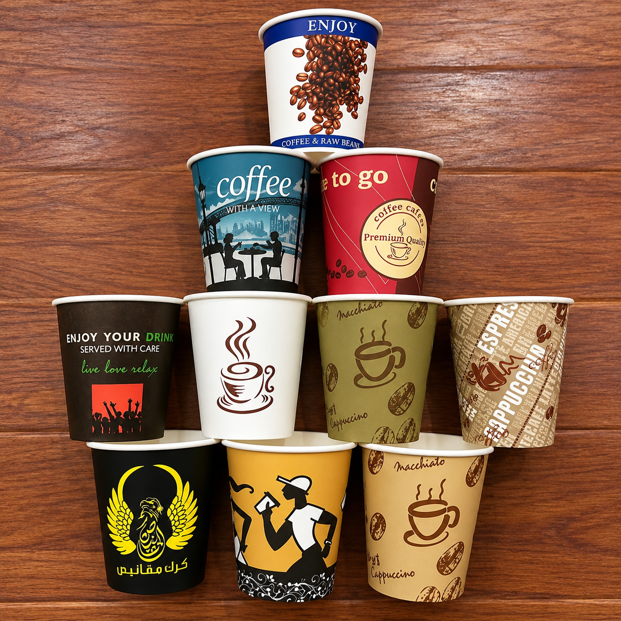
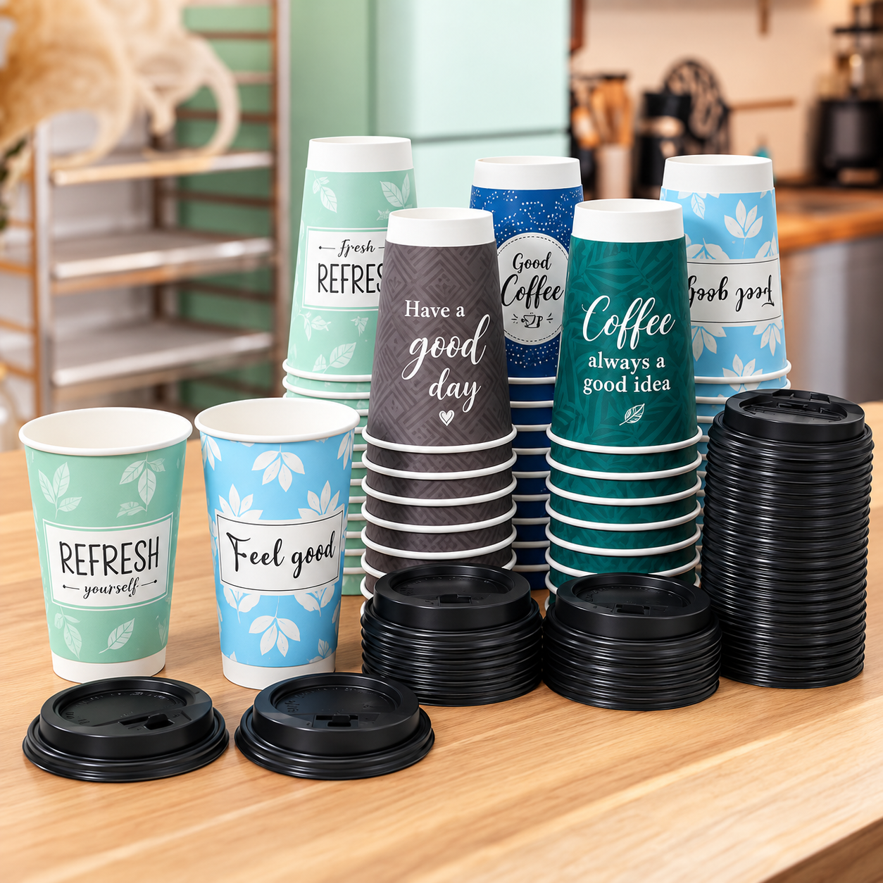
You choose a print process by matching your order volume, design complexity and color-accuracy needs — not by assuming one method is universally better. Flexographic printing is the process we run for paper cups, offering strong economics at recurring order volumes with solid, consistent color. Offset printing, used more broadly in packaging, favors fine photographic detail at a cost and setup profile suited to different volumes. The right choice depends on what you’re actually printing and how many you’re ordering.
The problem you’re actually solving
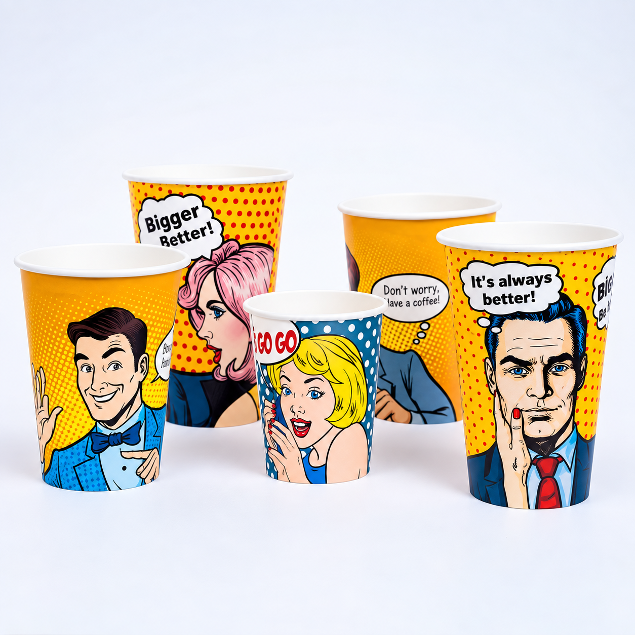
You’ve designed artwork with a subtle gradient and a precise brand color. Your supplier prints your run, and it doesn’t quite match what you approved on screen or in a proof. Now you’re wondering whether the process, the proofing step, or the artwork itself is the problem.
This happens because different print processes handle color, gradients and fine detail differently, and skipping a physical proof compounds the risk regardless of which process you use. A screen is luminous; a printed cup is ink on paper or coated board. Matching them precisely requires the right process for your design and a confirmed physical sample, not just a digital proof.
Definitions: what actually separates these processes
Process fit. Flexo works from flexible printing plates and runs efficiently at speed, which is why it’s the process we use for cup printing. It handles solid colors and text well and performs consistently at recurring order volumes. Offset, more common in flat packaging and premium print work, favors fine photographic detail and complex gradients, generally at a different cost and setup profile than flexo.
Color stations. Each color in your design typically requires its own station or pass in flexo printing. More colors generally means more setup complexity and, often, a higher plate cost. Confirm your design’s color count early, since it directly affects setup cost and lead time.
Registration. This is how precisely each color layer aligns with the others on the finished cup. Registration accuracy affects whether fine text stays crisp and whether multi-color designs line up cleanly, especially around the cup’s curved, seamed surface.
Gradients. A smooth color gradient is generally more demanding for flexo than a solid color or simple line art, since it asks the process to render continuous tonal variation rather than distinct color blocks. If your design leans heavily on photographic gradients, discuss feasibility with us before finalizing artwork, rather than assuming any process renders it identically to your screen preview.
Migration and set-off. Migration refers to ink components transferring into the beverage itself — a food-contact safety question, generally controlled by keeping ink on the cup’s exterior surface, not the drink-contact side. Set-off is a different, more common issue: wet ink transferring onto the inside of the next cup when cups are stacked before the ink is fully dry. Both are controlled through ink formulation, drying process, and production handling, not something a buyer needs to solve, but worth understanding so you know what your supplier is actually controlling for.
Proof standard and Delta E. A physical, printed proof — not just a digital mockup — is how you confirm your actual color match before a bulk run. Delta E is the standard measurement of color difference between two samples, read with a spectrophotometer; a lower Delta E means a closer match to your target color. Ask your supplier what proofing step and measurement they use before you approve a run, rather than approving off a screen preview alone.
| Factor | Flexographic Printing | Offset Printing |
|---|---|---|
| Process fit | Flexible plates, efficient speed, and the process XINNENGPACK uses for paper cup printing. | More common in flat packaging and premium print work, with a different setup profile. |
| Solid colors and text | Handles solid colors, text and simple graphics well. | Can handle print detail, but the article does not present it as XINNENGPACK’s standard paper-cup option. |
| Fine photographic detail | More demanding when artwork relies heavily on photographic detail or gradients. | Generally favors fine photographic detail and complex gradients. |
| Complex gradients | Smooth gradients need feasibility review before artwork is finalized. | Often better aligned with detailed tonal work in broader packaging applications. |
| Setup profile | More colors mean more setup complexity and often higher plate cost. | Generally a different cost and setup profile than flexo. |
| Color/setup considerations | Color stations, registration, proofing and Delta E checks should be confirmed for the design. | Still requires proofing because screen color and printed ink are not identical. |
| XINNENGPACK process status | Current paper-cup process uses flexographic printing with soybean- and corn-based inks. | If offset is specifically required, confirm feasibility directly rather than assuming standard availability. |
What we can document for your order
We run flexographic printing using soybean- and corn-based inks, which is a real, current part of our process, not a general industry claim. For anything specific to your exact design — total color count, gradient feasibility, or Pantone matching — send your artwork and we’ll give you a print-feasibility assessment for that specific design, rather than a general answer.
If your project specifically requires offset printing, confirm that need with us directly rather than assuming it’s available as a standard option — we’ll tell you honestly what we can support for your design.
What to prepare before you request a quote
Submit vector artwork — AI, PDF or EPS — with logos as outlines and colors specified in CMYK or Pantone, not a low-resolution JPG or PNG, since those often aren’t print-ready even at high resolution. If you don’t have vector artwork, tell us, and we can help fit your design into a printable template.
Keep in mind the cup’s printing surface is curved, not flat. Full-bleed designs distort when the printed sheet wraps around the formed cup, so keep important text and logos away from the seam, rim and bottom. Specify any metallic color, like gold or silver — these typically involve a different process with its own price and MOQ considerations, and are worth flagging early rather than discovering during a quote.
If brand color accuracy matters to you, provide a Pantone reference number and plan to confirm it against a physical, printed sample rather than a digital proof — a press sample is a closer match to your final run than an on-screen mockup will ever be.
Where this guidance doesn’t generalize
This article describes general print-process trade-offs and our own current process capability. It isn’t a substitute for a design-specific feasibility check — complex designs can behave differently than general guidance predicts, and only a review of your actual artwork tells you what to expect.
Color matching has inherent limits regardless of process. Even a well-controlled print run carries some Delta E variance from your target, and metallic or specialty colors carry more variance than standard process colors. Confirm your tolerance for that variance before committing to a bulk order.
FAQ
Can I get an exact Pantone match on a paper cup?
You can get close, generally within an acceptable Delta E range for most standard colors, but an exact match to a digital swatch isn’t guaranteed on any print process. Confirm your target color against a physical printed sample before approving a bulk run.
Does flexo printing handle photographic designs well?
It handles solid colors, text and simple graphics well. Detailed photographic gradients are more demanding for flexo generally. Send your specific artwork for a feasibility check rather than assuming either way.
What’s the difference between migration and set-off?
Migration is ink potentially reaching the beverage — a food-contact safety concern, generally controlled by keeping ink on the cup’s exterior. Set-off is wet ink transferring onto the next stacked cup before it’s dry — a production-handling issue, not a food-contact one.
Can I print gold or silver on my cup?
Often yes, but it typically uses a different process with its own pricing and MOQ. Flag this early in your request so we can quote it accurately rather than adjusting later.
Do I need a physical proof, or is a digital mockup enough?
A physical, printed proof is how you actually confirm color match. A digital mockup shows layout and design intent, but screen color and printed ink color aren’t the same thing.
Upload your artwork for a print-feasibility review
Send us your design file, color count, and any Pantone references you’re working with. We’ll assess feasibility for your specific artwork and tell you honestly what to expect before you commit to a bulk run.